Logo: Difference between revisions
Rtystgeeke (talk | contribs) No edit summary |
Adding in becca's finding GM-Exp-Norm. |
||
| (3 intermediate revisions by 2 users not shown) | |||
| Line 13: | Line 13: | ||
== Font == | == Font == | ||
===Updates as of November 2024=== | |||
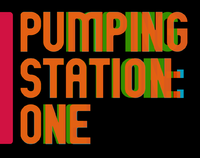
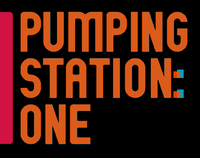
becca did some amazing work and figured out the font: | |||
<blockquote>The logo uses GM-Exp-Norm ([https://www.google.com/search?q=GM-Exp-Norm found on most font download websites for free]). In the logo, the text is scaled horizontally to be roughly 5-10% more narrow than default font width.</blockquote> | |||
[[File:Ps1-font-1.png|200px]] | |||
[[File:Ps1-font-2.png|200px]] | |||
===Previous findings=== | |||
The exact font is unknown and you can blame [[User:Balloonbaron|James T. Burke]] for that. | The exact font is unknown and you can blame [[User:Balloonbaron|James T. Burke]] for that. | ||
It appears that it is a hybrid font made by mixing a bunch of fonts and rounding over select corners - Jim you monster. | It appears that it is a hybrid font made by mixing a bunch of fonts and rounding over select corners - Jim you monster. | ||
[https://www.dafont.com/edmund.font Edmund] will get you 95% of the way there if you're looking for just one font to quickly whip up something. | |||
===Characters of note=== | ===Characters of note=== | ||
M - [https://www.myfonts.com/fonts/made-deduk/delvon-family/alt-semi-bold/ Delvon Family Alt] - just a weird | M - [https://www.myfonts.com/fonts/made-deduk/delvon-family/alt-semi-bold/ Delvon Family Alt] - most notable element, just a weird shaped stroke stem combo and I've only found it here | ||
S,G - | |||
S,G,A - [https://www.myfonts.com/fonts/din-studio/netraly Netraly] - of note the terminals are far from the median and the s has an almost horizontal spine, the A has a tall crossbar | |||
P,U,T,I,O,N,E - [https://www.myfonts.com/fonts/june-23/framer-sans/700/ Framer Sans 700] - these letters are pretty standard in many fonts, but I believe this one font covers them all the closest | |||
P - [https://www.myfonts.com/fonts/graphicfresh/edmund/regular/ Edmund Regular] (there's a [https://www.dafont.com/edmund.font free version])- the closed counter is squared off here and can also be an influence of small rounded corners | |||
Latest revision as of 20:16, 5 November 2024
Logo
The Logos through the history of Pumping Station: One


Font
Updates as of November 2024
becca did some amazing work and figured out the font:
The logo uses GM-Exp-Norm (found on most font download websites for free). In the logo, the text is scaled horizontally to be roughly 5-10% more narrow than default font width.
Previous findings
The exact font is unknown and you can blame James T. Burke for that.
It appears that it is a hybrid font made by mixing a bunch of fonts and rounding over select corners - Jim you monster.
Edmund will get you 95% of the way there if you're looking for just one font to quickly whip up something.
Characters of note
M - Delvon Family Alt - most notable element, just a weird shaped stroke stem combo and I've only found it here
S,G,A - Netraly - of note the terminals are far from the median and the s has an almost horizontal spine, the A has a tall crossbar
P,U,T,I,O,N,E - Framer Sans 700 - these letters are pretty standard in many fonts, but I believe this one font covers them all the closest
P - Edmund Regular (there's a free version)- the closed counter is squared off here and can also be an influence of small rounded corners

